Showing posts with label 2. Planning. Show all posts

Wednesday, 30 March 2016

Stylistic Influences of Artwork

Whilst attempting to subvert from the themes by the original artist, we did attempt to take some influence from other artists, directors and music videos etc.
Our CD cover was created based on the idea that it had to have some form of link to the accompanying music video. This was loosely influenced by Oasis' Definitely Maybe album which contained images linking to several of their music videos, mainly seen through the way both the cover and the videos were edited visually. (Similar colour schemes and shading for desired emotional response)
 
We decided to take this more literally and included an image taken directly from a clip we intend to use in our video that we took while location scouting in order to draw a clear link between this and our video when it is finished, much like Oasis did with every video from the album.
 
Our video itself was influenced by several different sources and we took a lot of influence from the idea of the 'Mini Movie' craze that has become far more popular in recent years. We were however cautions of the criticisms of this idea with several artists (Most notably Dave Grohl from the 'Foo Fighters') believing it to be ruining the idea of the music video. Based on this, we made our story slightly less obvious, deciding against including any dialogue or in fact a traditional narrative.

Saturday, 19 March 2016

Account of Meetings

During the course of the project, we made clear we need to meet consistently to produce the video and ancillaries to a high standard. We organised this by using a spreadsheet that all of us had access to during the task to decide when to meet up and the tasks we would set out to at the meeting. The spreadsheet mentioned is shown below.

Friday, 18 March 2016

Shoot Plan & Mise-En-Scene of the Website

Mise-en-Scene:
For our website we have decided to subvert from a lot of the conventions used by the original artist.
We will utilise screenshots from our final production piece and landscape shots taken when filming in order to make up the background, as opposed to Madeon who used a landscape artwork rather than a real picture. This background will be enhanced in order to be the middle ground between the two contrasting moods in the video. This will be the tone throughout the rest of the website.
The information will be laid out in a very simple and easy to use way through the use of tabs linking to different pages and large text boxes with information displayed in a simple list form.
The conventions of the genre and of music in general will be conveyed through the frequent use of the artists logo and brand.


Colour Scheme:
we have chosen to use several different vibrant colours for the text boxes and the text itself. This was an attempt to adhere to the conventions of the genre. This was decided through the frequent use of neon and strobe lighting seen in different music videos categorised in the same genre and is something we will pay homage to.
The background may make the text colour difficult to choose as it is likely to consist of several different colours which may blend the text in. We will attempt to counteract this by adding a translucent layer behind the text to help distinguish the text from the background.


Below is the homepage of Madeon's official website:

Monday, 1 February 2016

Character Profiles

In order to effectively convey the narrative of our music video, the characters had to be very well planned out and contrasting. As we opted for a narrative which contrasted two different moods throughout, the characters had to be complete polar opposites in terms of emotion and dress sense. We also plan to contrast them with the use of the weather when filming and effects in post-production.
Happy character:
This character is to be portrayed as the stereotypical teenager who's actions frequently suggest he has not got a care in the world.
The emotions conveyed through actions and facial expressions will be viewed as being overall positive.
The miss en scene (especially costume) will be presented in the most positive way possible. For example, his attire will consist of bright colours and will make him appear quite smart and well put together. (The colour and lighting may also be changed during post production in order to convey this)
Sad character:
In contrast to the only other character in this production, this character subverts from the dominant stereotype and is portrayed as a much darker, more morbid person. The aim is to convey the message that unfortunate events have caused this character pain and he is try in to deal with it in whatever way possible.
Similarly, the facial expressions and mise en scene play key roles The portrayal of this character.
The costume will consist of darker and more depressing colours and will attempt to be similar clothes to that which is stereotypically worn by unsavoury characters.

Tuesday, 19 January 2016

Brand Development

We created this Glogster to illustrate how we improved on the designs of our products in order to make them stand out with a clear house style and layout. We also did this to promote the brand identity and the image of the artist which we want the audience to view.

Brand Development

Wednesday, 6 January 2016

Storyboard of Madeon's "Finale" Music Video


This is the storyboard for our production and with this, it will aid us in what order we will be shooting in. In addition, the storyboard will help us in knowing which shots we need to film and the transition between shots in post production.

Friday, 11 December 2015

Company Logo


This is our company logo, we created it as we needed a logo for our production company which we will be known as for the production of the our music video and ancillery tasks. The logo was created in Photoshop and the logo is circular as we created the logo with ideas from music video production companies and record labels in the dance music scene which had logos we saw as effective and successful. One such label we too idea from is Spinnin' Records where all of their releases have their logo in the centre and the logo is effective in making people recognise the label from the logo itself.


Saturday, 5 December 2015

Location Scouting


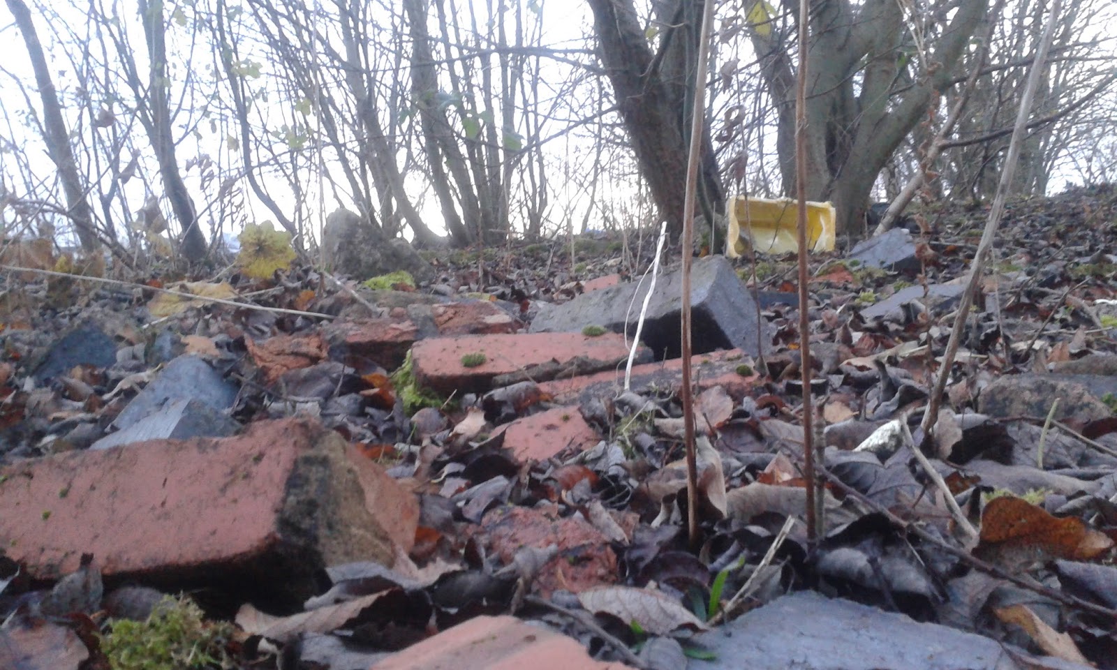
We decided to use an abandoned quarry site for some of our music video. This is because we think the site could work well with the mise-en-scene with the depressed protagonist part of the music video. We will need to use health and safety forms to outline the dangers of entering this site but there doesn't seem to be any dangerous which threaten our life in the site.