Friday, 25 March 2016

Saturday, 19 March 2016
Account of Meetings
During the course of the project, we made clear we need
to meet consistently to produce the video and ancillaries to a high standard. We organised
this by using a spreadsheet that all of us had access to during the
task to decide when to meet up and the tasks we would set out to at the
meeting. The spreadsheet mentioned is shown below.


Friday, 18 March 2016
Shoot Plan & Mise-En-Scene of the Website
Mise-en-Scene:
For our website we have decided to subvert from a lot of the conventions used by the original artist.
We will utilise screenshots from our final production piece and landscape shots taken when filming in order to make up the background, as opposed to Madeon who used a landscape artwork rather than a real picture. This background will be enhanced in order to be the middle ground between the two contrasting moods in the video. This will be the tone throughout the rest of the website.
The information will be laid out in a very simple and easy to use way through the use of tabs linking to different pages and large text boxes with information displayed in a simple list form.
The conventions of the genre and of music in general will be conveyed through the frequent use of the artists logo and brand.
Colour Scheme:
we have chosen to use several different vibrant colours for the text boxes and the text itself. This was an attempt to adhere to the conventions of the genre. This was decided through the frequent use of neon and strobe lighting seen in different music videos categorised in the same genre and is something we will pay homage to.
The background may make the text colour difficult to choose as it is likely to consist of several different colours which may blend the text in. We will attempt to counteract this by adding a translucent layer behind the text to help distinguish the text from the background.
Below is the homepage of Madeon's official website:

For our website we have decided to subvert from a lot of the conventions used by the original artist.
We will utilise screenshots from our final production piece and landscape shots taken when filming in order to make up the background, as opposed to Madeon who used a landscape artwork rather than a real picture. This background will be enhanced in order to be the middle ground between the two contrasting moods in the video. This will be the tone throughout the rest of the website.
The information will be laid out in a very simple and easy to use way through the use of tabs linking to different pages and large text boxes with information displayed in a simple list form.
The conventions of the genre and of music in general will be conveyed through the frequent use of the artists logo and brand.
Colour Scheme:
we have chosen to use several different vibrant colours for the text boxes and the text itself. This was an attempt to adhere to the conventions of the genre. This was decided through the frequent use of neon and strobe lighting seen in different music videos categorised in the same genre and is something we will pay homage to.
The background may make the text colour difficult to choose as it is likely to consist of several different colours which may blend the text in. We will attempt to counteract this by adding a translucent layer behind the text to help distinguish the text from the background.
Below is the homepage of Madeon's official website:

Friday, 11 March 2016
Making The Website
Over the past few weeks we have been creating a website as an ancillary task to accompany the video and the CD cover.

 We decided to use the webpage creator Wix to get the best
possible design for our website. We chose a template which had a similar
look to what we were hoping to make and began to edit. This was the original template's home page
which appeared to need a lot of work to change. Firstly, we needed to
change the background to something more appropriate to our project
(which would feature on all of the pages that follow) after several
different backgrounds were tested, we opted for a scenic screen capture
from our video which we then had to edit so that the lighting and
colours allowed for text to be viewed. We also removed the large icon
and text from the centre and replace it with a large title of our artist
to be placed at the very top of the page. The social media links were
also moved and were each linked to Madeon's official pages.
We decided to use the webpage creator Wix to get the best
possible design for our website. We chose a template which had a similar
look to what we were hoping to make and began to edit. This was the original template's home page
which appeared to need a lot of work to change. Firstly, we needed to
change the background to something more appropriate to our project
(which would feature on all of the pages that follow) after several
different backgrounds were tested, we opted for a scenic screen capture
from our video which we then had to edit so that the lighting and
colours allowed for text to be viewed. We also removed the large icon
and text from the centre and replace it with a large title of our artist
to be placed at the very top of the page. The social media links were
also moved and were each linked to Madeon's official pages.
The navigation buttons at the bottom were only added to this page whilst the ones at the top remained in the header on the rest of the pages.


The News page was fairly straight forward in terms of the design. We simply split the text box which scrolled down the page into two parts in order to have everything instantly seen without the need to scroll down as this affected the size of the background picture. Once we had finished doing that, we were able to fill in the information with events including the plan for the music video and the release of the song we were covering. We also decided at this point to colour code each page, making the boxes red throughout as opposed to the flashing multi-coloured ones that were originally there.
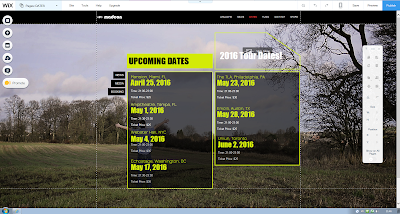
We did a followed a near identical process for the news page, splitting the text box and adding in information about a tour including dates, location and price.


For the music page, we had to replace the music app that already existed and opted for YouTube clips with links to the same songs on iTunes. We had originally had 4 videos on the page, however due to the aspect ratio on certain computers, not all could be viewed properly.

We created our own brand new Store page which frequently features on real artists' websites selling merchandise etc. We added images of genuine Madeon merchandise and made some realistic prices to acconpany them.

The header contains the Artist's title alongside the logo From the initial 'M'. This logo is also a button that links directly to the homepage.

 We decided to use the webpage creator Wix to get the best
possible design for our website. We chose a template which had a similar
look to what we were hoping to make and began to edit. This was the original template's home page
which appeared to need a lot of work to change. Firstly, we needed to
change the background to something more appropriate to our project
(which would feature on all of the pages that follow) after several
different backgrounds were tested, we opted for a scenic screen capture
from our video which we then had to edit so that the lighting and
colours allowed for text to be viewed. We also removed the large icon
and text from the centre and replace it with a large title of our artist
to be placed at the very top of the page. The social media links were
also moved and were each linked to Madeon's official pages.
We decided to use the webpage creator Wix to get the best
possible design for our website. We chose a template which had a similar
look to what we were hoping to make and began to edit. This was the original template's home page
which appeared to need a lot of work to change. Firstly, we needed to
change the background to something more appropriate to our project
(which would feature on all of the pages that follow) after several
different backgrounds were tested, we opted for a scenic screen capture
from our video which we then had to edit so that the lighting and
colours allowed for text to be viewed. We also removed the large icon
and text from the centre and replace it with a large title of our artist
to be placed at the very top of the page. The social media links were
also moved and were each linked to Madeon's official pages.The navigation buttons at the bottom were only added to this page whilst the ones at the top remained in the header on the rest of the pages.


The News page was fairly straight forward in terms of the design. We simply split the text box which scrolled down the page into two parts in order to have everything instantly seen without the need to scroll down as this affected the size of the background picture. Once we had finished doing that, we were able to fill in the information with events including the plan for the music video and the release of the song we were covering. We also decided at this point to colour code each page, making the boxes red throughout as opposed to the flashing multi-coloured ones that were originally there.

We did a followed a near identical process for the news page, splitting the text box and adding in information about a tour including dates, location and price.


For the music page, we had to replace the music app that already existed and opted for YouTube clips with links to the same songs on iTunes. We had originally had 4 videos on the page, however due to the aspect ratio on certain computers, not all could be viewed properly.
We decided to completely scrap the bio page as it was not vital to the
website and it didn't seem to blend very well with the other content.

We created our own brand new Store page which frequently features on real artists' websites selling merchandise etc. We added images of genuine Madeon merchandise and made some realistic prices to acconpany them.

The header contains the Artist's title alongside the logo From the initial 'M'. This logo is also a button that links directly to the homepage.
Wednesday, 9 March 2016
Shoot Plan & Mise-En-Scene of Album Artwork
As we began filming, we took into consideration the house style of the entire project. We discussed that it would be best to have the artwork and the website be in a similar style to the music video. We came across a metal gate (which had obviously had something strike it) so we used that as a base for the front and back cover.
As we picked the dates to film the music video, we decided we would use certain shots from the film to use in the artwork. We particuarly emphasised on the mise en scene and the proxemics of the characters. We chose the brighter looking shots to use for the postive protagonist whereas we used negative shots to use for the negative character. This was done with the lighting from each shot and the cinema style effects which were used in Photoshop to make the different characters different within each image of the album artwork. In addition to lighting and effects. We also tried to make the sky more visible in the postive characters images rather than the negative one to promote the sence of isolation within those images.


As we picked the dates to film the music video, we decided we would use certain shots from the film to use in the artwork. We particuarly emphasised on the mise en scene and the proxemics of the characters. We chose the brighter looking shots to use for the postive protagonist whereas we used negative shots to use for the negative character. This was done with the lighting from each shot and the cinema style effects which were used in Photoshop to make the different characters different within each image of the album artwork. In addition to lighting and effects. We also tried to make the sky more visible in the postive characters images rather than the negative one to promote the sence of isolation within those images.


Sunday, 6 March 2016
Green Screen Practice
Today we practiced the use of editing with green screens. As a result, we used the colour key in Premiere Pro to create this.


Saturday, 5 March 2016
Editing & Effects Practice
We have been testing and playing around with various effects both from the Premiere Pro program itself and from 3rd party sources such as RampantMedia which we got the glitch/grunge effects from which we have practiced in the video above.
The effects were available with this YouTube instructional video which gave us instructions on how to make the effects work well with the video it affects. In the effects package, we received 4k resoultion clips which we placed over clips and then change the settings little by little and to tweak the footage in order to give the best possible outcome with the effects overlaying the video.
The instructional video we used is below and it walked through how to do everything in a simple way.
Subscribe to:
Posts (Atom)